|
Ello made the rounds through my Facebook feed yesterday. I had the privilege of receiving an invite from a friend a few weeks ago, so I was in the lovely position to hand out invitations and watch my friends populate the left-hand grid of circles, arriving one-by-one like citizens new to a town. The earliest adopters among my friends are those I think of as social media old skoolers—in other words, LiveJournalers. That was the comparison they frequently made--that they felt like they were back on LiveJournal. I had a LiveJournal, like everyone did in those brutal early aughts, but was never a dedicated community member. I described my ello experience as like a community garden. Another word that felt apt: it is humane.  I’m not speaking of the user interface, which is still a bit fraught and jerky, a little too minute (and I’ve already endured far too much complaint about the body font). I’m speaking of ello’s speed and mood. The sparse typeface, ample leading between returns, considerate white space, simple shapes—it feels manageable and pleasant. My friends write longer, and more meaningfully, than on Facebook, and it lacks the bratty 4chan-ism of Tumblr. Even that trouble UI slows you down, makes rapid posting tiresome. Cumulatively, ello creates a much needed sensibility of repose in an otherwise frenetic social media environment. Come here, tend your garden, look at my garden, let’s chat, and then let me leave. All of this, of course, could just be a by-product of scale. Right now I only have 16 people as Friends and 6 people as Noise. What happens when that number becomes 50, 100, 200? What happens when too much is happening on my feed? What happens when they inevitably need to monetize the space? Will ello prioritize maintaining that sense of poise which I think is its greatest asset? We often treat our media as all good or all bad—either its running us, or it’s the next step on the path to our transhumanist destiny. I prefer Marshall McLuhan’s formulation of media effects (and affects!), which is that for every sense a media extends, it also amputates something else. What we’ve struggle with since the emergence of digitized social media networks is quickly they consume our lives and reshape everything in their image. When I think of this in McLuhan-esque terms, this is a problem of extension and amputation. Facebook, Twitter, Tumblr—they extend us far and often amputate too much.  What we’ve need for a long time isn’t an etiquette for social media, but practice, as Western networked humans, at dilating between the plunge and the withdrawal. As a species, we are simply untrained at this, and our technology designers are often drunk on technology’s own mysticism—giving us more integration, content and volume when we really just need is something more moderate, better designed.
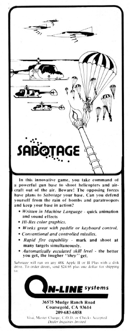
And many of us have been unhappy with these forms of social media, especially Facebook, for a long time. Ello is a social network informed by many things we’ve wearied of in social networks—endless feeds, constant communication, the politics (and often clunky methods) for following but not following people you have to follow but may not like. Ello feels like a space not built for over-extension. Social networks like Facebook never had the chance to get these things right because they, in some sense, invented the problem. It’s not their’s to solve. This, I think, is what gives the space for ello to plot out its own parcel of land. Where this is going is hard to predict, but suffice to say: I like the gesture. Much referenced but never actually seen is the original ad Roberta and Ken Williams took out as On-Line Systems for Hi-Res Adventure: Mystery House, in the May 1980 issue of MICRO: The 6502 Journal. The 6502 was the microprocessor used in the Apple II, which was the machine On-Line initially produced all their products for during their first couple years in operation in the early 80s. While some sources claim it was a quarter page ad, we can clearly see that it was a full-page piece. From the extensive text to the prices to the almost entirely unknown two other arcade games sold alongside Mystery House (Skeetshoot and Trapshoot), there's lots to chew on here. I'm not one for "Holy Grails" of game history, but...I must admit to certain fascination with this ad. It's a pleasure to put this back in circulation. 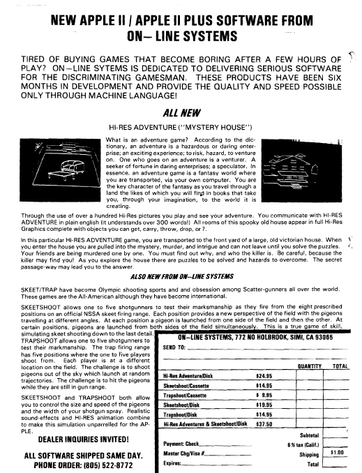 This post will be adding some more details and some of my own aesthetic analysis to my last post, Illustration in Video Game History. I've been extraordinary lucky to have caught the attention of Roberta Williams' brother-in-law, John Williams (Ken Williams' brother). John managed most of Sierra On-Line's marketing, especially in the very early days when the whole enterprise was basically under his charge. He watched my Provost Talk, felt that my analysis resonated with him, and has been kindly letting me pick his brain about Sierra, particularly their marketing. Following up on some questions illustration dealer and historian Robert Reed has asked in the comments section of the last blog, about how much Sierra paid for these illustrations: According to John, the very earliest stuff was (roughly guessing 1980-1982) was done for around $100 a pop (about 40 bucks today), and mostly composed by local high schoolers and rouge Coarsegold hippies (see examples of some early 1981 On-Line ads below).
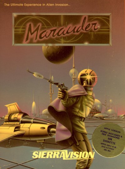
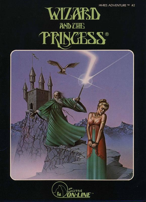
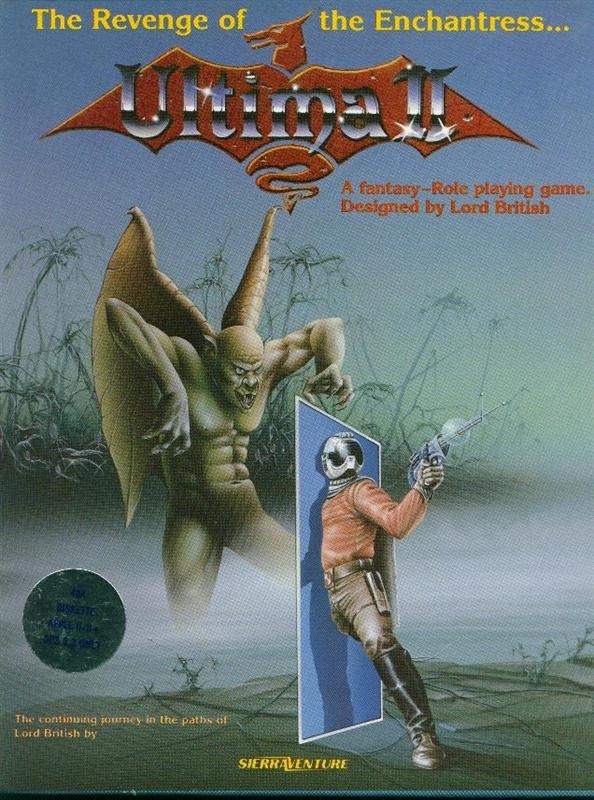
The Stinson piece, however (see my last post) which is from 1984 and part of the black box releases of the Hi-Res Adventure series, was commissioned at about $800-1000, according to John Williams. Inflation calculators tell me this about about the equivalent of $2000 - $2400 then, or $300 – $380 now--which sounds about right, although low, for the quality of the work, but perhaps Roger Reed will correct me on this? These prices were inclusive of full license to reproduce the work on boxes, ads, promotion, etc. John Williams has also informed me that Stinson also did the artwork for the computer arcade-style game Marauder (1982), and possibly Ultima I and II (1983 and 1982, respectively, see explanation below), as well as some of On-Line's competitors.
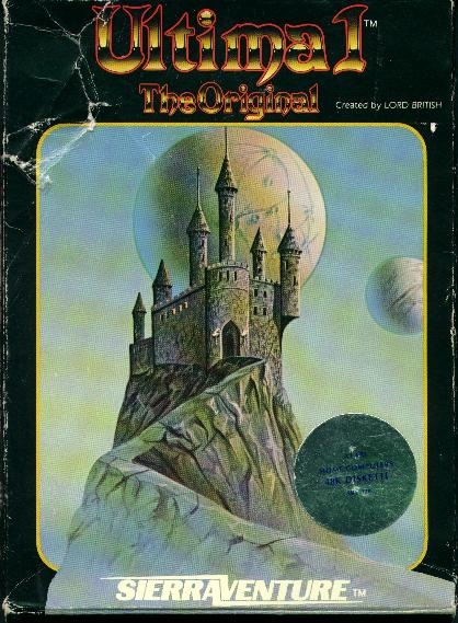
My assessment of these covers is formally speculative, I'm not an expert at these matters, but do have a BFA in graphic design that helps inform my readings. So, it's a fact that Ultima I and II had the same artist—the castle from the Ultima I box is actually just from the back of the Ultima II box (see back and front of Ultima II box here). Sierra's Ultima I came a year AFTER the Ultima II release, because it was simply an Atari 8-bit port of the game, which had been originally published in 1981 for the Apple II by California Pacific Computer Co.
I struggle to decide whether Stinson was also the artist on the Ultima games. Marauder's main figure has a similar ¾ posture to the figure in Ultima II, and the helmets and guns strongly share stylistic qualities. However, the Marauder figure's pose is much more awkward (as are those of The Wizard and the Princess). Very stiff, physiologically improbable, and the detail in the clothing is overworked. By contrast, the foreshortening of the left thigh in Ultima II shows a good degree of competence with drawing human anatomy--whereas Marauder and W&P seem to purposefully avoid the more natural poses that would require foreshortening of the legs. Yet again, the foreshortening of the gun arm in Marauder is much stronger than the over-cocked arm in Ultima II. I'm not sure how to read that a-genital winged troll/orc thing—part of what might be tripping me up is a difference in materials used, as I realize now that I can't tell if these covers are brush painted or airbrushed. The castle on the back of the Ultima II cover seems telling to me. While very structurally similar to that of The Wizard and the Princess--with its tropey fantasy illustration standards of turrets, flagpoles, jagged stone walkway and the balancing presence of a spherical object in the sky (the wizard's blast in W&P, a moon in Ultima II)--the Ultima II castle is much more convincingly rendered, the atmospherics more smooth, and the outline of the castle against the sky less jarring. Given that The Wizard and the Princess cover was painted in 1984, and the Ultima II cover designed in 1982, I'd actually argue that what Stinson did was a riff on the work of whoever did the Ultima II cover (or maybe he was just paid a ton more; Ultima II was a HUGE deal, and Richard Garriot demanded invested, professional packaging and marketing--which I guess shows you what the standard was in the early 1980s). Was Stinson just cheaply copying his previous Ultima work for The Wizard and the Princess? Would love feedback from what others think who are versed in these matters—I'm always in the mood to refine my aesthetic detective skills! I'd also be interested to know, from players, if these settings actually represented real locales in any of these games (was there a castle far away on a stone walkway? a swamp?) With all my writing, I've not yet gotten around to playing The Wizard and the Princess--although I know, at least, to LOOK at rocks and watch out for scorpions :) |
Archives
March 2020
Categories
All
|
 RSS Feed